Tuesday, October 1, 2013

Statistical Map


Statistical Maps like this one shows the data collected about different statistics.  This partical map is charting the commute averages between states.  The national mean is 24.3 minutes. We live in Florida which is 24.1 to 26 minutes average statewide.  More populated states seem to take longer to get to work than the less populated states.

This map is found at:  http://mappery.com/map-of/United-States-Travel-Time-to-Work-Statistical-Map

Cartogram


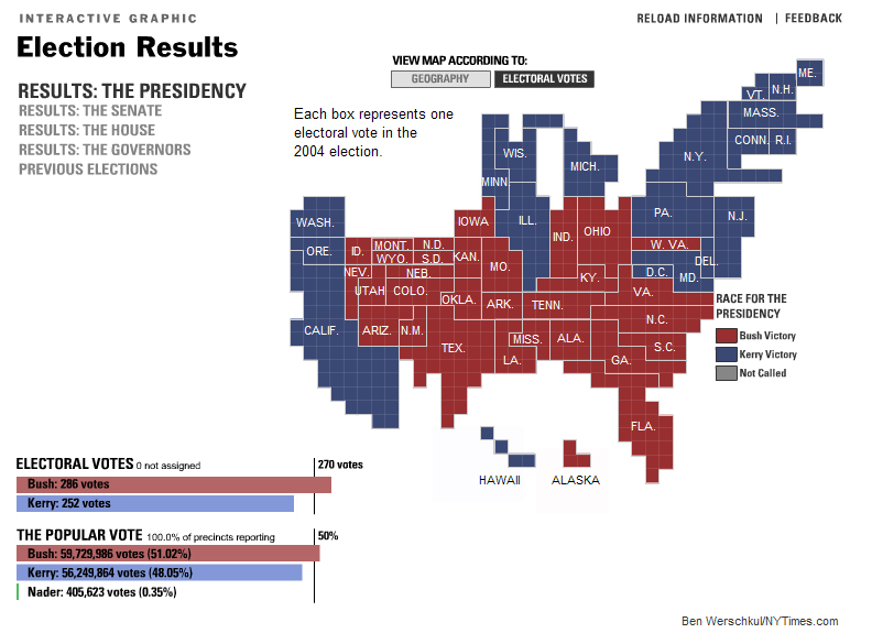
This cartogram documents the electoral vote breakdown from the Presidential election of 2004.  The state is the size of how many electoral votes it receives in a presidential election.  Cartograms can be used to show statistics for all types of locational demographics, whether it be horticulture, animal life, or politics.

This map is found at:  http://vis.berkeley.edu/courses/cs294-10-fa07/wiki/images/a/ae/NYTCartogram2000.jpg

Sunday, September 29, 2013

Topographic Map


This is a topographic map of Hawaii.  The map shows the elevation of the island.  This island has a shield volcano.
The map is found on: http://volcano.oregonstate.edu/vwdocs/vwlessons/activities/l_number3.html

Bilateral graph

Trade with Africa 2005-2009 graph

This is a bilateral graph charting trade between China and Africa.  The chart exhibits the exports, imports, and the two combined.  You can see by looking at the graph how all trade has dropped between 2008 and 2009.  With all years, imports are larger than exports.
The bilateral graphs can be used to show the fluctuation grades, profits, or even population.

This graph was found at:  http://www.cieca.org.tw/DB/english/page/bil-1-1.htm

Thematic Map


This is a thematic map of the 1980 presidential election.  The election of 1980 is the earliest presidential election I can remember.  The map distinguishes what party held which states for electoral votes.  The red states indicate the states that Ronald Reagan won and the blue states indicate the states in which Jimmy Carter won.  The map has a clear legend to the right.
This map is found at:  http://1984election.com/

Tuesday, September 24, 2013

Box Plot


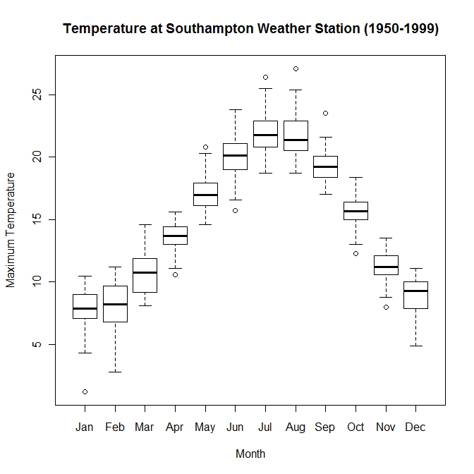
The box plot shows the range of temperatures that recorded from 1950-1999.  With this map, you can see the entire range of temperatures.  The box represents the 25%-75% range of the data.  The black line represents the median of the entire range.  With this chart, you can recognize which months have a broader range in temperatures and some that do not deviate much much at all.


This map is found at:  http://www.wekaleamstudios.co.uk/wp-content/uploads/2010/04/boxwhisker-base.jpeg

Histogram


This is a histogram map.  This particular histogram is charting a group of workers and the amount of money the workers make in a day.  The chart is easy to understand.  I have seen this type of map used with charting test scores.  At a glance you cannot only see the narrow specifics of $25 increments, but also see the broader views of where the bulk of the numbers are located on the chart.
The map was found at:
http://image.wistatutor.com/content/feed/tvcs/Histogram2520basic.GIF