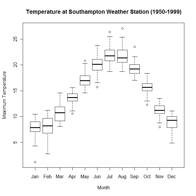
The box plot shows the range of temperatures that recorded from 1950-1999. With this map, you can see the entire range of temperatures. The box represents the 25%-75% range of the data. The black line represents the median of the entire range. With this chart, you can recognize which months have a broader range in temperatures and some that do not deviate much much at all.
This map is found at: http://www.wekaleamstudios.co.uk/wp-content/uploads/2010/04/boxwhisker-base.jpeg
No comments:
Post a Comment