Friday, October 25, 2013

Propaganda Map

Click the image to open in full size.

This is a propaganda map of the United States from the view of a Texan.  My father is a Texan, so I find this quite humorous. He is 66 years old and moved from his "home" when he was 20. You can take the man out of Texas, but you cannot take the Texas out of the man.  Texans have a state pride like no other I have ever seen.
This map is found at:
http://historum.com/general-history/9905-propaganda-maps-2.html

Isohyet Map

Isohyet ImagesThis is an Isohyet map of the Island of Kauai in Hawaii.  This map charts the rainfall on the island.
This map is found at:
http://rainfall.geography.hawaii.edu/downloads.html


Isopach Map


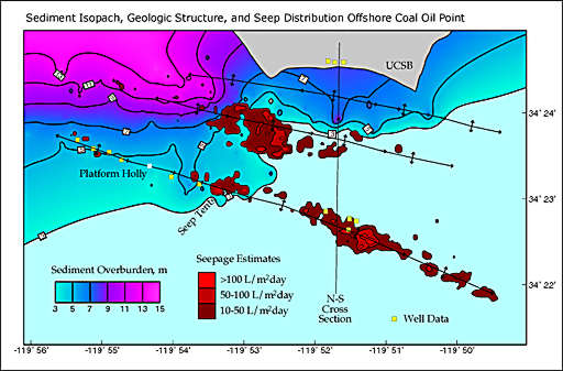
This is an isopach map.  The isopach map usually charts minerals and natural resources.  The map above charts sediment on the ocean floor and gas seepage.
This map is found at:
http://seeps.geol.ucsb.edu/pages/isopach.html

Infrared Aerial Photo


This is an infrared aerial photo of Arbuckle Tract in Florida.  I chose this map because it shows all the campsites, hiking trails, and even boat ramps found at Arbuckle Tract.

This map was found at:
http://www.outintheboonies.com/Arbuckle_Tract/

Isotach Map

300K analysis at 1200 UTC on 18 December

This is the Isotach map of the December storm in 2009.
This map was found at:
http://www.erh.noaa.gov/gsp/localdat/cases/2009/18-20DecemberWinterStorm/18-20DecemberWinterStorm.html

Isobar

Weather map with isobars

This is an Isobar map.  The isobar map shows the lines of constant pressure.
This map was found at:
http://www.nc-climate.ncsu.edu/edu/k12/.IsobarIsotherm

DRG


This is a Digital Raster Graphic of Emerald Bay.  In a DRG , the elevation is marked.  The map also charts the land levels within bay.

This map was found at:
http://tahoe.usgs.gov/DRG.html

DOQQ


This is a DOQQ, digital orthophoto quadrangle, map.  This map is an image taken from a satellitte.  They can be in grey scale or natural colors.

This map is found at:
http://www.geomart.com/products/geodata/doqq/index.htm

Triangular Plot

Triangular Diagram 1

This is a Triangular Plot.  Triangular plots use an equilateral triangle with measurements on every side.  This one is charting the percentages of plutonic rocks found in California.
This map is found at:
http://www.siskiyous.edu/class/geol20/GraniticRockClass.html

Wind Rose


This is a Wind Rose charting rain.  The table to the right can assist in reading the chart.  The Wind Rose is used to chart the direction of wind.  It uses 16 different directions.

This map was found at:
http://vistadatavision.com/reports/wind-rose/

Climograph

Yakutsk climograph

This is a climograph of Yakutsk, Russia.  The chart shows the precipitation and temperature of the city.  This can be used to predict what the weather will be like the following year.
This map was found at:
http://www.earthonlinemedia.com/ipg/outlines/climates_subarctic.html

Star Plot

Assets Statistics
This is a star plot.  The star plot can be used to compare several different atributes of an item.  You can compare cities with: precipitation, temperature, crime, population, etc.  All on one plot.
I chose this plot because it has different colors and is visually stimulating.

This map is found at:
https://www.rmetrics.org/node/35

Similarity Matrix


This is a similarity matrix of Statistics from famous baseball players.  Charts like this can be used to compare different players in a team to each other or other teams.
This map was found at:
http://www.softcodedlogic.com/ratebaseballplayers.htm

Stem and Leaf Plot

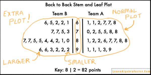
Back to Back Stem and Leaf Plot

This is an example of a Back to Back Stem and Leaf Plot. I chose this plot because it was easy to follow and explains itself.  You can use Stem and Leaf Plots to chart data, but also to work out algebraic equations as shown in this image.
This map is found at:
http://learnalgebrafaster.com/back-to-back-stem-and-leaf-plot/

Population Pyramid


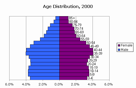
This is a population pyramid of age distribution in 2000.  This type of map can be use to compare side by side two different demographics.  This one used male and female and charted their age distribution.  You could use educated against uneducated, or even different race groups.

This map is found at:
http://www.censusscope.org/us/chart_age.html

Scatter plot


This is a scatter plot of Old Faithfuls eruptions-the duration and frequency.  A map like this one could be used with tourism.  The national park could make filers when the geyser is most likely to erupt to inform tourist.
This map is found at:
http://en.wikipedia.org/wiki/Scatter_plot

Index Value Plot

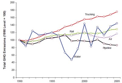
Line chart plot of emissions values over a time period extending from 1990 to 2005 for five data sets. The level in 1990 serves as the index value of 100. The trend for trucking is steadily upward, and the most pronounced of all, approaching 180 in the year 2005. The trend for rail is steadily upward, approaching 130 in the year 2005. The trend for air oscillates slightly and approaches 120 in the year 2005. The trend for pipeline is upward about 118 in the year 1997, then downward and approaches 82 in the year 2005. The trend for water oscillates wildly, hitting a low of 55 in 1996 and trending upward to end near 140 in the year 2005.

This is an index value plot charting the greenhouse gas emissions between the years 1990 and 2005. This would be useful information for those making environmental changes to these industries.  The companies can track to see if their efforts are working or where they should direct their concentration.
This map was found at:
http://www.fhwa.dot.gov/policy/otps/innovation/issue1/policies.htm

Accumulation Plot

 of precipitation accumulation at Lubbock for 2012 (blue). Also plotted are the normal yearly precipitation distribution (red) and last year's precipiation (2011 - in magenta) for Lubbock. Graph courtesy of the Northeast Regional Climate Center (NERCC).

This is an accumulation plot of the precipitation in Lubbock, TX.  Accumulation plots, such as this one, can not only show the statistics for more than 1 year(dark blue and magenta), but also show what the normal statistics(red line) are for the area.
This map was found at:
http://www.srh.noaa.gov/lub/?n=2012-record-countdown-final

Sunday, October 20, 2013

LIDAR

lg-map-lidar3.jpg (600×433)

This is a LIDAR map of the World Trade Center from July 2001.  These maps are used by combining the use of Light and Laser.  They scan an area with a laser and measure the reflection of the light.
The map is found at http://www.loc.gov/exhibits/911/911-maps.html.

Cadastral map


This is a cadastral map of Washington DC; the mall and surrounding area.  Cadastral Maps are used to ownership of the land.
This map is found at http://www.dcvote.org/trellis/character/historicalmaps.cfm?print=1.

Friday, October 18, 2013

Remote Sensing


This is a kml satelitte image of South Dakota, Montana, Nebrask, and North Dakota in October 2013.  There was a an early blizzard the first week of October resulting in terrible deaths to the area's cattle.  The cattle had not yet grown their thick winter coats and were not protected from the weather. Many cattle either died from being frozen or suffocated after the combination of rain and snow.  25,000 people lost power.
A view like this clearly shows the magnitude of the event.  

Tuesday, October 1, 2013

Doppler Radar


Doppler Radar pictures are used to show weather.  This is an image of Hurricane Ophelia from 2005.
The map shows not only where the storm is located, but also the size and intensity.

This map is found at:  http://www.dnr.sc.gov/climate/sco/Tropics/HurricaneReports/2005/hurricane_Ophelia.php

Black and White Aerial Photo

New York City Manhattan street aerial view black and white with skyscrapers, pedestrian and busy traffic. Stock Photo - 14361178

This is a black and white aerial photo of New York City.  The Black and White aerial photos show the depth and texture of the area.  I chose New York City not only because it is one of my favorites cities, but because of the great architecture of the buildings.  If you just see a footprint of the city, you don't get the full picture of the buildings.

This photo is found at:  http://www.123rf.com/photo_14361178_new-york-city-manhattan-street-aerial-view-black-and-white-with-skyscrapers-pedestrian-and-busy-traf.html

Statistical Map


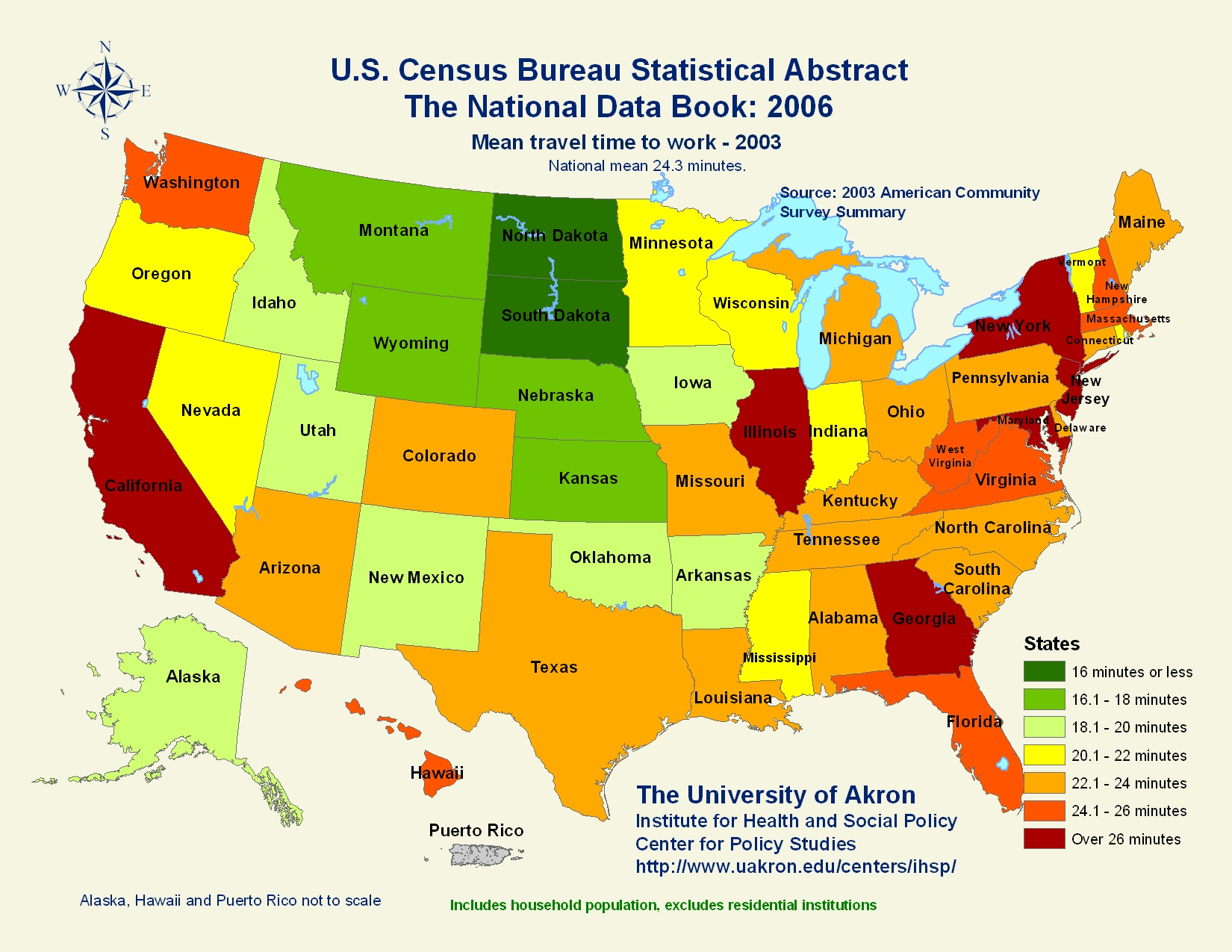
Statistical Maps like this one shows the data collected about different statistics.  This partical map is charting the commute averages between states.  The national mean is 24.3 minutes. We live in Florida which is 24.1 to 26 minutes average statewide.  More populated states seem to take longer to get to work than the less populated states.

This map is found at:  http://mappery.com/map-of/United-States-Travel-Time-to-Work-Statistical-Map

Cartogram


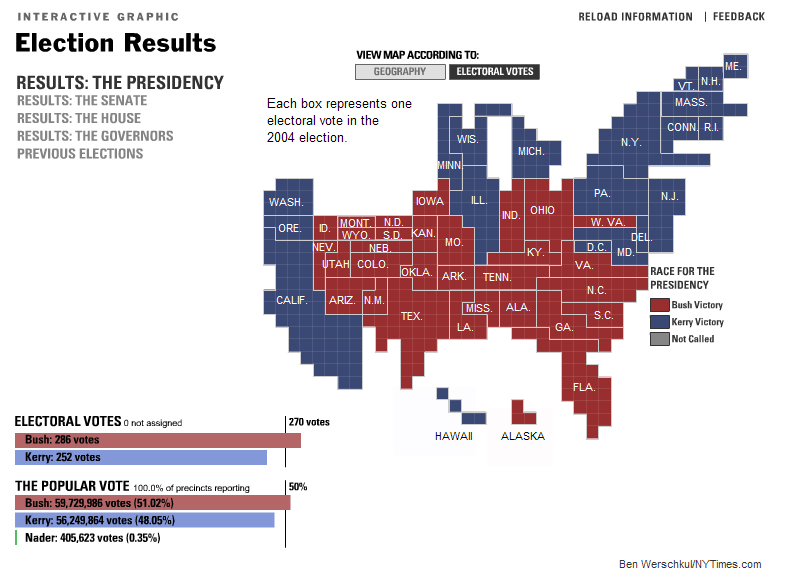
This cartogram documents the electoral vote breakdown from the Presidential election of 2004.  The state is the size of how many electoral votes it receives in a presidential election.  Cartograms can be used to show statistics for all types of locational demographics, whether it be horticulture, animal life, or politics.

This map is found at:  http://vis.berkeley.edu/courses/cs294-10-fa07/wiki/images/a/ae/NYTCartogram2000.jpg